Typography, the art and technique of arranging type, is a pivotal element in design that often goes unnoticed by the untrained eye. However, its impact on conveying messages, creating mood, and guiding users through digital interfaces is profound. Mastering typography can transform a good design into an exceptional one, enhancing its power to communicate effectively with audiences in the digital age.
Understanding Typography
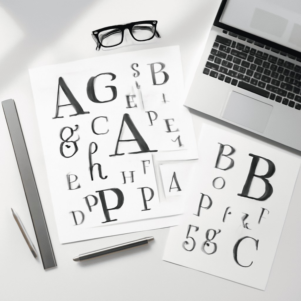
At its core, typography is about more than just making text legible. It's about making it readable, impactful, and expressive. With the vast array of typefaces available today, the choices can seem overwhelming. Yet, understanding the fundamentals — including typeface, font, size, line spacing (leading), letter spacing (kerning), and alignment — can empower designers to make informed decisions that heighten the overall design narrative.
The Role of Typography in Digital Design
In the digital space, where user attention spans are fleeting, typography can dictate a user's first impression and engagement with content. An elegant and readable typeface can entice readers and enhance comprehension, while a poorly chosen or cramped font can repel an audience. Here are some key principles to harness typography effectively in digital design:
-
Readability and Legibility: These are fundamental. Choose fonts and text sizes that are easy to read on various devices. Sans-serif fonts are often preferred for web content due to their clarity on screens.
-
Hierarchy and Contrast: Typography helps establish a visual hierarchy, guiding the viewer's eye through content logically and effortlessly. Contrast in type size, weight, and color can direct attention to the most critical elements, such as headings and calls to action.
-
Consistency: Consistent typography fosters familiarity and trust. Stick to a limited selection of typefaces and styles throughout your design to maintain harmony and coherence.
-
Emotion and Tone: Typeface selection can evoke different emotions and convey the tone of the content. For instance, a playful script font may be suitable for an informal blog, while a clean, modern sans-serif might be better for a tech company's website.
-
Alignment and White Space: Proper alignment of text improves organization and readability, while the strategic use of white space gives the design room to breathe, ensuring it doesn't overwhelm the audience.
The Impact of Responsive Typography
As devices proliferate from large desktop monitors to small mobile screens, responsive typography becomes crucial. Ensuring your type scales correctly across different devices maintains readability and aesthetic appeal. Techniques such as fluid typography and using scalable units like 'em' or 'rem' are effective strategies to achieve this adaptiveness.
The Psychological Influence of Typography
Typography can subtly influence the emotional response and decision-making process of an audience. For instance, a recent study revealed that readers perceive information set in hard-to-read fonts as more complex, which can affect user interaction with the content. Thus, designers should be aware of how typographic choices can alter user perception and behavior, optimizing them to achieve desired outcomes.
In Conclusion
Mastering typography in the digital age is akin to unlocking a new dimension of design potential. It's about finding the delicate balance between aesthetic appeal and functional efficiency. By investing in a deep understanding of typography and applying its principles adeptly, designers can craft communication pieces that not only capture attention but also convey messages with clarity and emotion.
In a world inundated with digital information, typography remains an invisible force that can compel an audience to pause, engage, and act. As designers, embracing the power of typography paves the way to creating impactful, meaningful digital experiences.